
![图片[1]-QW-1899-admin](https://www.ppaoo.com/wp-content/uploads/2026/05/image-7-1024x639.png)
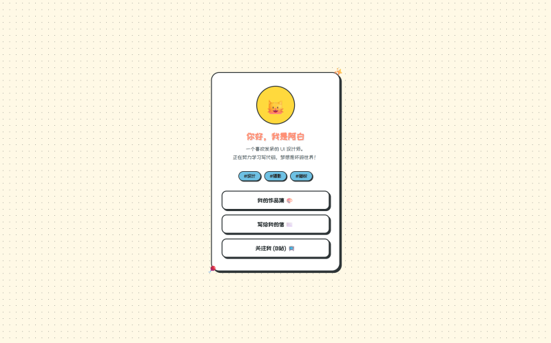
🎨 极简卡通个人主页代码
<!DOCTYPE html>
<html lang="zh-CN">
<head>
    <meta charset="UTF-8">
    <meta name="viewport" content="width=device-width, initial-scale=1.0">
    <title>我的卡通小窝</title>
    <!-- 引入谷歌的可爱手写字体 -->
    <link href="https://fonts.googleapis.com/css2?family=Fredoka:wght@400;600&family=ZCOOL+KuaiLe&display=swap" rel="stylesheet">
    <style>
        :root {
            --bg-color: #FFF9E6; /* 奶油黄背景 */
            --card-bg: #FFFFFF;
            --primary: #FF8E72;  /* 珊瑚红 */
            --secondary: #6EC1E4; /* 天空蓝 */
            --accent: #FFD93D;    /* 柠檬黄 */
            --text: #2D3436;
            --border: 3px solid #2D3436;
            --shadow: 5px 5px 0px #2D3436;
        }

        * {
            box-sizing: border-box;
            margin: 0;
            padding: 0;
        }

        body {
            font-family: 'Fredoka', 'ZCOOL KuaiLe', sans-serif;
            background-color: var(--bg-color);
            color: var(--text);
            display: flex;
            justify-content: center;
            align-items: center;
            min-height: 100vh;
            background-image: radial-gradient(#2D3436 1px, transparent 1px);
            background-size: 20px 20px; /* 点阵背景 */
        }

        .container {
            width: 90%;
            max-width: 400px;
            background: var(--card-bg);
            border: var(--border);
            border-radius: 25px;
            box-shadow: var(--shadow);
            padding: 40px 30px;
            text-align: center;
            position: relative;
            transition: transform 0.3s ease;
        }

        /* 鼠标悬停时的俏皮浮动效果 */
        .container:hover {
            transform: translateY(-5px);
            box-shadow: 8px 8px 0px #2D3436;
        }

        /* 头像区域 */
        .avatar-box {
            width: 120px;
            height: 120px;
            background: var(--accent);
            border: var(--border);
            border-radius: 50%;
            margin: 0 auto 20px;
            display: flex;
            justify-content: center;
            align-items: center;
            font-size: 60px;
            overflow: hidden;
            position: relative;
        }

        /* 简单的CSS画的小表情 */
        .face {
            font-size: 50px;
        }

        h1 {
            font-size: 28px;
            margin-bottom: 10px;
            color: var(--primary);
            text-shadow: 2px 2px 0px rgba(0,0,0,0.1);
        }

        p.bio {
            font-size: 16px;
            line-height: 1.6;
            margin-bottom: 30px;
            color: #636e72;
        }

        /* 标签样式 */
        .tags {
            display: flex;
            justify-content: center;
            gap: 10px;
            margin-bottom: 30px;
            flex-wrap: wrap;
        }

        .tag {
            background: var(--secondary);
            padding: 5px 15px;
            border: 2px solid #2D3436;
            border-radius: 20px;
            font-size: 14px;
            font-weight: 600;
            box-shadow: 2px 2px 0px #2D3436;
        }

        /* 按钮链接 */
        .links {
            display: flex;
            flex-direction: column;
            gap: 15px;
        }

        .btn {
            display: block;
            text-decoration: none;
            color: var(--text);
            background: #fff;
            padding: 15px;
            border: var(--border);
            border-radius: 15px;
            font-size: 18px;
            font-weight: 600;
            box-shadow: 4px 4px 0px #2D3436;
            transition: all 0.2s;
            position: relative;
        }

        .btn:hover {
            background: var(--primary);
            color: white;
            transform: translate(2px, 2px);
            box-shadow: 2px 2px 0px #2D3436;
        }

        .btn:active {
            transform: translate(4px, 4px);
            box-shadow: 0px 0px 0px #2D3436;
        }

        /* 装饰性的小元素 */
        .deco {
            position: absolute;
            font-size: 24px;
            animation: float 3s ease-in-out infinite;
        }
        .deco-1 { top: -15px; right: -15px; transform: rotate(15deg); }
        .deco-2 { bottom: -15px; left: -15px; transform: rotate(-15deg); animation-delay: 1.5s; }

        @keyframes float {
            0%, 100% { transform: translateY(0) rotate(15deg); }
            50% { transform: translateY(-10px) rotate(25deg); }
        }

    </style>
</head>
<body>

    <div class="container">
        <!-- 装饰元素 -->
        <div class="deco deco-1">✨</div>
        <div class="deco deco-2">🎈</div>

        <!-- 头像 -->
        <div class="avatar-box">
            <!-- 这里可以用你的图片替换,比如 <img src="your-photo.jpg"> -->
            <div class="face">🐱</div>
        </div>

        <!-- 名字 -->
        <h1>你好,我是阿白</h1>

        <!-- 简介 -->
        <p class="bio">
            一个喜欢发呆的 UI 设计师。<br>
            正在努力学习写代码,梦想是环游世界!
        </p>

        <!-- 标签 -->
        <div class="tags">
            <span class="tag">#设计</span>
            <span class="tag">#摄影</span>
            <span class="tag">#猫奴</span>
        </div>

        <!-- 链接按钮 -->
        <div class="links">
            <a href="#" class="btn">我的作品集 🎨</a>
            <a href="#" class="btn">写给我的信 ✉️</a>
            <a href="#" class="btn">关注我 (B站) 📺</a>
        </div>
    </div>

</body>
</html>![图片[2]-QW-1899-admin](https://www.ppaoo.com/wp-content/uploads/2026/05/image-8-1024x639.png)
🇨🇭 瑞士国际主义排版风个人主页
<!DOCTYPE html>
<html lang="zh-CN">
<head>
    <meta charset="UTF-8">
    <meta name="viewport" content="width=device-width, initial-scale=1.0">
    <title>Swiss Style Profile</title>
    <!-- 引入经典的无衬线字体 Inter -->
    <link href="https://fonts.googleapis.com/css2?family=Inter:wght@400;700;900&display=swap" rel="stylesheet">
    <style>
        :root {
            --bg-color: #F4F4F0; /* 米白色背景 */
            --text-main: #111111;
            --accent-red: #FF3B30; /* 瑞士红 */
            --accent-blue: #0047BB;
            --grid-line: #D1D1D1;
        }

        * {
            box-sizing: border-box;
            margin: 0;
            padding: 0;
        }

        body {
            font-family: 'Inter', -apple-system, BlinkMacSystemFont, sans-serif;
            background-color: var(--bg-color);
            color: var(--text-main);
            display: flex;
            justify-content: center;
            align-items: center;
            min-height: 100vh;
            /* 背景网格线 */
            background-image:
                linear-gradient(var(--grid-line) 1px, transparent 1px),
                linear-gradient(90deg, var(--grid-line) 1px, transparent 1px);
            background-size: 40px 40px;
        }

        .container {
            width: 90%;
            max-width: 420px;
            background: #FFFFFF;
            /* 只有黑色实线边框,无阴影,无圆角 */
            border: 2px solid var(--text-main);
            padding: 0; /* 移除内边距,用内部元素控制间距 */
            position: relative;
        }

        /* 顶部红色色块 */
        .header-block {
            background-color: var(--accent-red);
            height: 12px;
            width: 100%;
        }

        .content {
            padding: 40px 30px;
        }

        .avatar-box {
            width: 80px;
            height: 80px;
            background: var(--text-main);
            color: #fff;
            display: flex;
            justify-content: center;
            align-items: center;
            font-size: 32px;
            margin-bottom: 30px;
            /* 正方形,无圆角 */
            border-radius: 0;
        }

        h1 {
            font-size: 48px;
            font-weight: 900;
            line-height: 0.9;
            margin-bottom: 20px;
            letter-spacing: -2px;
            text-transform: uppercase;
        }

        p.bio {
            font-size: 16px;
            line-height: 1.5;
            margin-bottom: 40px;
            max-width: 90%;
            font-weight: 400;
            border-left: 4px solid var(--accent-blue); /* 左侧强调线 */
            padding-left: 15px;
        }

        .tags {
            display: flex;
            justify-content: flex-start;
            gap: 0; /* 瑞士风格通常紧凑 */
            margin-bottom: 40px;
            border-top: 1px solid var(--text-main);
            border-bottom: 1px solid var(--text-main);
            padding: 10px 0;
        }

        .tag {
            font-size: 12px;
            font-weight: 700;
            text-transform: uppercase;
            padding-right: 15px;
            margin-right: 15px;
            border-right: 1px solid var(--text-main);
        }
        .tag:last-child {
            border-right: none;
        }

        .links {
            display: flex;
            flex-direction: column;
            gap: 0;
        }

        .btn {
            display: flex;
            justify-content: space-between;
            align-items: center;
            text-decoration: none;
            color: var(--text-main);
            padding: 20px 0;
            border-bottom: 1px solid var(--grid-line);
            font-size: 18px;
            font-weight: 700;
            transition: all 0.2s;
        }

        .btn:last-child {
            border-bottom: none;
        }

        /* 箭头符号 */
        .btn::after {
            content: '→';
            font-size: 24px;
            opacity: 0;
            transform: translateX(-10px);
            transition: all 0.2s;
        }

        .btn:hover {
            color: var(--accent-red);
            padding-left: 10px;
        }

        .btn:hover::after {
            opacity: 1;
            transform: translateX(0);
        }

        /* 底部版权信息 */
        .footer {
            background: var(--text-main);
            color: #fff;
            padding: 10px 30px;
            font-size: 10px;
            display: flex;
            justify-content: space-between;
            text-transform: uppercase;
        }

    </style>
</head>
<body>

    <div class="container">
        <!-- 顶部装饰条 -->
        <div class="header-block"></div>

        <div class="content">
            <!-- 头像(极简方块) -->
            <div class="avatar-box">
                Gr
            </div>

            <!-- 名字(超大字号) -->
            <h1>Grid<br>System.</h1>

            <!-- 简介 -->
            <p class="bio">
                设计即秩序。<br>
                专注于排版、网格与功能性美学。
            </p>

            <!-- 标签(表格化) -->
            <div class="tags">
                <span class="tag">Typography</span>
                <span class="tag">Grid</span>
                <span class="tag">Art</span>
            </div>

            <!-- 链接按钮(列表化) -->
            <div class="links">
                <a href="#" class="btn">Projects</a>
                <a href="#" class="btn">Manifesto</a>
                <a href="#" class="btn">Contact</a>
            </div>
        </div>

        <!-- 底部栏 -->
        <div class="footer">
            <span>© 2024</span>
            <span>Zurich Style</span>
        </div>
    </div>

</body>
</html>![图片[3]-QW-1899-admin](https://www.ppaoo.com/wp-content/uploads/2026/05/image-9-1024x639.png)
💧 液态玻璃风个人主页
<!DOCTYPE html>
<html lang="zh-CN">
<head>
    <meta charset="UTF-8">
    <meta name="viewport" content="width=device-width, initial-scale=1.0">
    <title>Liquid Glass Profile</title>
    <link href="https://fonts.googleapis.com/css2?family=Outfit:wght@300;500;700&display=swap" rel="stylesheet">
    <style>
        :root {
            --glass-bg: rgba(255, 255, 255, 0.15);
            --glass-border: rgba(255, 255, 255, 0.4);
            --glass-highlight: rgba(255, 255, 255, 0.6);
            --text-main: #1a1a1a;
            --text-sub: #4a4a4a;
        }

        * {
            box-sizing: border-box;
            margin: 0;
            padding: 0;
        }

        body {
            font-family: 'Outfit', sans-serif;
            height: 100vh;
            display: flex;
            justify-content: center;
            align-items: center;
            background: #0f0c29;
            overflow: hidden;
            position: relative;
        }

        /* 流动的液态背景球体 */
        .liquid-blob {
            position: absolute;
            border-radius: 50%;
            filter: blur(40px);
            opacity: 0.8;
            animation: float 12s infinite ease-in-out;
        }

        .blob-1 {
            width: 400px;
            height: 400px;
            background: linear-gradient(135deg, #ff00cc, #333399);
            top: -100px;
            left: -100px;
            animation-delay: 0s;
        }

        .blob-2 {
            width: 350px;
            height: 350px;
            background: linear-gradient(135deg, #00dbde, #fc00ff);
            bottom: -80px;
            right: -80px;
            animation-delay: -4s;
        }

        .blob-3 {
            width: 250px;
            height: 250px;
            background: linear-gradient(135deg, #f857a6, #ff5858);
            top: 40%;
            left: 60%;
            animation-delay: -8s;
        }

        @keyframes float {
            0%, 100% { transform: translate(0, 0) scale(1); border-radius: 60% 40% 30% 70% / 60% 30% 70% 40%; }
            25% { transform: translate(30px, -50px) scale(1.1); border-radius: 30% 60% 70% 40% / 50% 60% 30% 60%; }
            50% { transform: translate(-20px, 20px) scale(0.9); border-radius: 50% 60% 30% 60% / 30% 60% 70% 40%; }
            75% { transform: translate(20px, 50px) scale(1.05); border-radius: 60% 40% 60% 30% / 60% 30% 40% 60%; }
        }

        /* 液态玻璃卡片 */
        .container {
            width: 90%;
            max-width: 380px;
            background: var(--glass-bg);
            backdrop-filter: blur(25px) saturate(180%);
            -webkit-backdrop-filter: blur(25px) saturate(180%);
            border: 1px solid var(--glass-border);
            border-top: 1px solid var(--glass-highlight);
            border-left: 1px solid var(--glass-highlight);
            border-radius: 30px;
            padding: 50px 30px;
            text-align: center;
            box-shadow:
                0 25px 50px -12px rgba(0, 0, 0, 0.25),
                inset 0 0 20px rgba(255, 255, 255, 0.1);
            z-index: 1;
            position: relative;
            overflow: hidden;
        }

        /* 卡片表面的光泽反射 */
        .container::before {
            content: '';
            position: absolute;
            top: -50%;
            left: -50%;
            width: 200%;
            height: 200%;
            background: radial-gradient(circle, rgba(255,255,255,0.2) 0%, transparent 60%);
            transform: rotate(30deg);
            pointer-events: none;
        }

        .avatar-box {
            width: 110px;
            height: 110px;
            margin: 0 auto 25px;
            background: rgba(255, 255, 255, 0.2);
            border-radius: 50%;
            padding: 4px;
            box-shadow:
                0 8px 32px rgba(0, 0, 0, 0.1),
                inset 0 0 10px rgba(255, 255, 255, 0.3);
            position: relative;
            z-index: 2;
        }

        .avatar-box div {
            width: 100%;
            height: 100%;
            background: rgba(255, 255, 255, 0.3);
            border-radius: 50%;
            display: flex;
            justify-content: center;
            align-items: center;
            font-size: 50px;
            backdrop-filter: blur(10px);
        }

        h1 {
            font-size: 28px;
            font-weight: 700;
            color: #fff;
            margin-bottom: 12px;
            text-shadow: 0 2px 10px rgba(0,0,0,0.1);
            position: relative;
            z-index: 2;
        }

        p.bio {
            font-size: 15px;
            color: rgba(255, 255, 255, 0.85);
            line-height: 1.7;
            margin-bottom: 30px;
            font-weight: 300;
            position: relative;
            z-index: 2;
        }

        .tags {
            display: flex;
            justify-content: center;
            gap: 10px;
            margin-bottom: 35px;
            position: relative;
            z-index: 2;
        }

        .tag {
            font-size: 12px;
            padding: 6px 16px;
            background: rgba(255, 255, 255, 0.2);
            border: 1px solid rgba(255, 255, 255, 0.3);
            border-radius: 20px;
            color: #fff;
            backdrop-filter: blur(5px);
            font-weight: 500;
        }

        .links {
            display: flex;
            flex-direction: column;
            gap: 16px;
            position: relative;
            z-index: 2;
        }

        .btn {
            display: block;
            text-decoration: none;
            color: #fff;
            background: rgba(255, 255, 255, 0.15);
            padding: 16px;
            border-radius: 18px;
            font-size: 16px;
            font-weight: 500;
            border: 1px solid rgba(255, 255, 255, 0.2);
            transition: all 0.3s ease;
            backdrop-filter: blur(10px);
            position: relative;
            overflow: hidden;
        }

        .btn::before {
            content: '';
            position: absolute;
            top: 0;
            left: -100%;
            width: 100%;
            height: 100%;
            background: linear-gradient(90deg, transparent, rgba(255,255,255,0.3), transparent);
            transition: left 0.5s;
        }

        .btn:hover {
            background: rgba(255, 255, 255, 0.3);
            transform: translateY(-3px);
            box-shadow: 0 10px 30px rgba(0, 0, 0, 0.2);
        }

        .btn:hover::before {
            left: 100%;
        }

    </style>
</head>
<body>

    <!-- 流动的液态背景 -->
    <div class="liquid-blob blob-1"></div>
    <div class="liquid-blob blob-2"></div>
    <div class="liquid-blob blob-3"></div>

    <div class="container">
        <!-- 头像 -->
        <div class="avatar-box">
            <div>💧</div>
        </div>

        <!-- 名字 -->
        <h1>Liquid Glass</h1>

        <!-- 简介 -->
        <p class="bio">
            在流动的光影中寻找静谧<br>
            透明,是最复杂的色彩
        </p>

        <!-- 标签 -->
        <div class="tags">
            <span class="tag">Fluid</span>
            <span class="tag">Glass</span>
            <span class="tag">Design</span>
        </div>

        <!-- 链接按钮 -->
        <div class="links">
            <a href="#" class="btn">探索作品</a>
            <a href="#" class="btn">关于我</a>
            <a href="#" class="btn">联系我</a>
        </div>
    </div>

</body>
</html>![图片[4]-QW-1899-admin](https://www.ppaoo.com/wp-content/uploads/2026/05/image-6-1024x639.png)
👾 复古像素风个人主页
<!DOCTYPE html>
<html lang="zh-CN">
<head>
    <meta charset="UTF-8">
    <meta name="viewport" content="width=device-width, initial-scale=1.0">
    <title>像素小站</title>
    <!-- 引入像素字体 -->
    <link href="https://fonts.googleapis.com/css2?family=DotGothic16&family=ZCOOL+KuaiLe&display=swap" rel="stylesheet">
    <style>
        :root {
            --bg-color: #5C94FC; /* 超级马里奥天空蓝 */
            --card-bg: #FFFFFF;
            --primary: #E70012;  /* 马里奥红 */
            --accent: #FFCC00;   /* 金币黄 */
            --text: #000000;
            --border: 4px solid #000000;
        }

        * {
            box-sizing: border-box;
            margin: 0;
            padding: 0;
            /* 关键:禁用抗锯齿,让边缘保持锯齿状 */
            image-rendering: pixelated;
        }

        body {
            font-family: 'DotGothic16', 'ZCOOL KuaiLe', sans-serif;
            background-color: var(--bg-color);
            color: var(--text);
            display: flex;
            justify-content: center;
            align-items: center;
            min-height: 100vh;
            /* 像素风背景图案 */
            background-image:
                linear-gradient(45deg, #4a85e0 25%, transparent 25%, transparent 75%, #4a85e0 75%, #4a85e0),
                linear-gradient(45deg, #4a85e0 25%, transparent 25%, transparent 75%, #4a85e0 75%, #4a85e0);
            background-size: 20px 20px;
            background-position: 0 0, 10px 10px;
        }

        .container {
            width: 90%;
            max-width: 400px;
            background: var(--card-bg);
            border: var(--border);
            /* 关键:直角,没有圆角 */
            border-radius: 0;
            padding: 40px 30px;
            text-align: center;
            position: relative;
            /* 像素风阴影:不使用模糊 */
            box-shadow: 8px 8px 0px #000000;
        }

        /* 头像区域 - 变成方形 */
        .avatar-box {
            width: 120px;
            height: 120px;
            background: var(--accent);
            border: var(--border);
            border-radius: 0; /* 方形 */
            margin: 0 auto 25px;
            display: flex;
            justify-content: center;
            align-items: center;
            font-size: 60px;
            position: relative;
            box-shadow: 4px 4px 0px #000000;
        }

        h1 {
            font-size: 28px;
            margin-bottom: 15px;
            color: var(--primary);
            text-transform: uppercase;
            letter-spacing: 2px;
        }

        p.bio {
            font-size: 16px;
            line-height: 1.8;
            margin-bottom: 30px;
            color: #333;
            background: #f0f0f0;
            padding: 10px;
            border: 2px solid #000;
        }

        /* 标签样式 - 像素块 */
        .tags {
            display: flex;
            justify-content: center;
            gap: 10px;
            margin-bottom: 35px;
            flex-wrap: wrap;
        }

        .tag {
            background: #000;
            color: #fff;
            padding: 5px 12px;
            border-radius: 0;
            font-size: 14px;
            font-weight: bold;
        }

        /* 按钮链接 - 3D像素按钮 */
        .links {
            display: flex;
            flex-direction: column;
            gap: 20px;
        }

        .btn {
            display: block;
            text-decoration: none;
            color: #000;
            background: var(--accent);
            padding: 15px;
            border: var(--border);
            border-radius: 0;
            font-size: 18px;
            font-weight: bold;
            /* 像素按钮的立体感来源 */
            box-shadow: inset -4px -4px 0px 0px rgba(0,0,0,0.5);
            transition: all 0.1s;
            position: relative;
        }

        .btn:hover {
            background: #fff;
            transform: translateY(-2px);
            box-shadow: inset -4px -4px 0px 0px rgba(0,0,0,0.2), 4px 4px 0px #000;
        }

        .btn:active {
            transform: translateY(2px);
            box-shadow: inset 4px 4px 0px 0px rgba(0,0,0,0.5);
        }

        /* 装饰:像素云 */
        .pixel-cloud {
            position: absolute;
            width: 60px;
            height: 20px;
            background: #fff;
            top: -30px;
            left: -30px;
            box-shadow:
                10px -10px 0 0 #fff,
                20px -20px 0 0 #fff,
                30px -10px 0 0 #fff,
                40px 0 0 0 #fff;
            border: 2px solid #000; /* 简化的云边框 */
            display: none; /* 复杂边框在纯CSS较难完美实现,此处仅作示意 */
        }

        .deco-star {
            position: absolute;
            font-size: 30px;
            top: -20px;
            right: -20px;
            animation: blink 1s steps(2) infinite;
        }

        @keyframes blink {
            to { visibility: hidden; }
        }

    </style>
</head>
<body>

    <div class="container">
        <!-- 装饰 -->
        <div class="deco-star">⭐</div>

        <!-- 头像 -->
        <div class="avatar-box">
            👾
        </div>

        <!-- 名字 -->
        <h1>PLAYER ONE</h1>

        <!-- 简介 -->
        <p class="bio">
            LV.99 前端开发者<br>
            技能:写Bug、喝咖啡、通关游戏
        </p>

        <!-- 标签 -->
        <div class="tags">
            <span class="tag">GAME</span>
            <span class="tag">CODE</span>
            <span class="tag">RPG</span>
        </div>

        <!-- 链接按钮 -->
        <div class="links">
            <a href="#" class="btn">START GAME (主页)</a>
            <a href="#" class="btn">ITEM BOX (作品)</a>
            <a href="#" class="btn">CONTACT (联系)</a>
        </div>
    </div>

</body>
</html>![图片[5]-QW-1899-admin](https://www.ppaoo.com/wp-content/uploads/2026/05/image-5-1024x639.png)
🌫️ 毛玻璃弥散风个人主页
<!DOCTYPE html>
<html lang="zh-CN">
<head>
    <meta charset="UTF-8">
    <meta name="viewport" content="width=device-width, initial-scale=1.0">
    <title>我的主页</title>
    <!-- 引入优雅的无衬线字体 -->
    <link href="https://fonts.googleapis.com/css2?family=Noto+Sans+SC:wght@300;500;700&display=swap" rel="stylesheet">
    <style>
        :root {
            --glass-bg: rgba(255, 255, 255, 0.25);
            --glass-border: rgba(255, 255, 255, 0.5);
            --text-main: #2c3e50;
            --text-sub: #546e7a;
            --btn-bg: rgba(255, 255, 255, 0.6);
            --btn-hover: #ffffff;
        }

        * {
            box-sizing: border-box;
            margin: 0;
            padding: 0;
        }

        body {
            font-family: 'Noto Sans SC', sans-serif;
            height: 100vh;
            display: flex;
            justify-content: center;
            align-items: center;
            /* 梦幻的渐变背景 */
            background: linear-gradient(120deg, #a1c4fd 0%, #c2e9fb 100%);
            overflow: hidden;
            position: relative;
        }

        /* 背景中的漂浮光斑 */
        .blob {
            position: absolute;
            border-radius: 50%;
            filter: blur(60px);
            z-index: 0;
            opacity: 0.8;
            animation: float 10s infinite ease-in-out alternate;
        }
        .blob-1 { top: 10%; left: 20%; width: 300px; height: 300px; background: #ff9a9e; animation-delay: 0s; }
        .blob-2 { bottom: 10%; right: 20%; width: 350px; height: 350px; background: #a18cd1; animation-delay: -5s; }
        .blob-3 { top: 40%; left: 60%; width: 200px; height: 200px; background: #84fab0; animation-delay: -2s; }

        @keyframes float {
            0% { transform: translate(0, 0) scale(1); }
            100% { transform: translate(20px, 40px) scale(1.1); }
        }

        /* 毛玻璃卡片主体 */
        .container {
            width: 90%;
            max-width: 380px;
            background: var(--glass-bg);
            /* 核心:背景模糊 */
            backdrop-filter: blur(20px);
            -webkit-backdrop-filter: blur(20px);
            border: 1px solid var(--glass-border);
            border-radius: 30px;
            padding: 50px 30px;
            text-align: center;
            box-shadow: 0 15px 35px rgba(0, 0, 0, 0.1);
            z-index: 1; /* 确保在光斑之上 */
            position: relative;
        }

        .avatar-box {
            width: 110px;
            height: 110px;
            margin: 0 auto 20px;
            border-radius: 50%;
            background: rgba(255,255,255,0.4);
            padding: 5px; /* 内边距形成光环 */
            box-shadow: 0 8px 20px rgba(0,0,0,0.05);
        }

        .avatar-box img, .avatar-box div {
            width: 100%;
            height: 100%;
            border-radius: 50%;
            object-fit: cover;
            background: #fff;
            display: flex;
            justify-content: center;
            align-items: center;
            font-size: 50px;
        }

        h1 {
            font-size: 26px;
            font-weight: 700;
            color: var(--text-main);
            margin-bottom: 10px;
            letter-spacing: 1px;
        }

        p.bio {
            font-size: 15px;
            color: var(--text-sub);
            line-height: 1.6;
            margin-bottom: 25px;
            font-weight: 300;
        }

        .tags {
            display: flex;
            justify-content: center;
            gap: 8px;
            margin-bottom: 35px;
        }

        .tag {
            font-size: 12px;
            padding: 6px 14px;
            background: rgba(255, 255, 255, 0.3);
            border-radius: 20px;
            color: var(--text-main);
            border: 1px solid rgba(255,255,255,0.4);
            font-weight: 500;
        }

        .links {
            display: flex;
            flex-direction: column;
            gap: 15px;
        }

        .btn {
            display: block;
            text-decoration: none;
            color: var(--text-main);
            background: var(--btn-bg);
            padding: 16px;
            border-radius: 18px;
            font-size: 16px;
            font-weight: 500;
            transition: all 0.3s ease;
            border: 1px solid rgba(255,255,255,0.2);
        }

        .btn:hover {
            background: var(--btn-hover);
            transform: translateY(-3px);
            box-shadow: 0 10px 20px rgba(0,0,0,0.08);
        }

    </style>
</head>
<body>

    <!-- 背景光斑 -->
    <div class="blob blob-1"></div>
    <div class="blob blob-2"></div>
    <div class="blob blob-3"></div>

    <div class="container">
        <!-- 头像 -->
        <div class="avatar-box">
            <div>🌊</div>
        </div>

        <!-- 名字 -->
        <h1>云边有个小卖部</h1>

        <!-- 简介 -->
        <p class="bio">
            捕捉生活中的温柔瞬间。<br>
            记录、分享、感知。
        </p>

        <!-- 标签 -->
        <div class="tags">
            <span class="tag">生活</span>
            <span class="tag">随笔</span>
            <span class="tag">治愈</span>
        </div>

        <!-- 链接按钮 -->
        <div class="links">
            <a href="#" class="btn">阅读文章</a>
            <a href="#" class="btn">关于我</a>
            <a href="#" class="btn">联系方式</a>
        </div>
    </div>

</body>
</html>![图片[6]-QW-1899-admin](https://www.ppaoo.com/wp-content/uploads/2026/05/image-10-1024x639.png)
🖤 暗黑高级磨砂风个人主页
<!DOCTYPE html>
<html lang="zh-CN">
<head>
    <meta charset="UTF-8">
    <meta name="viewport" content="width=device-width, initial-scale=1.0">
    <title>Dark Premium Profile</title>
    <!-- 引入有衬线的优雅字体 -->
    <link href="https://fonts.googleapis.com/css2?family=Noto+Serif+SC:wght@400;700&family=Playfair+Display:ital,wght@0,600;1,600&display=swap" rel="stylesheet">
    <style>
        :root {
            --bg-dark: #0a0a0a;
            --card-bg: #141414;
            --text-main: #e0e0e0;
            --text-muted: #666666;
            --gold-accent: #D4AF37; /* 香槟金 */
        }

        * {
            box-sizing: border-box;
            margin: 0;
            padding: 0;
        }

        body {
            font-family: 'Noto Serif SC', serif;
            background-color: var(--bg-dark);
            color: var(--text-main);
            display: flex;
            justify-content: center;
            align-items: center;
            min-height: 100vh;
            /* 细腻的噪点纹理背景 */
            background-image: url("data:image/svg+xml,%3Csvg viewBox='0 0 200 200' xmlns='http://www.w3.org/2000/svg'%3E%3Cfilter id='noise'%3E%3CfeTurbulence type='fractalNoise' baseFrequency='0.65' numOctaves='3' stitchTiles='stitch'/%3E%3C/filter%3E%3Crect width='100%25' height='100%25' filter='url(%23noise)' opacity='0.08'/%3E%3C/svg%3E");
        }

        .container {
            width: 90%;
            max-width: 380px;
            background-color: var(--card-bg);
            border: 1px solid #222;
            padding: 60px 30px 50px;
            text-align: center;
            position: relative;
            /* 极细微的深邃阴影 */
            box-shadow: 0 20px 50px rgba(0, 0, 0, 0.8);
        }

        /* 顶部金色细线装饰 */
        .container::before {
            content: '';
            position: absolute;
            top: 0;
            left: 50%;
            transform: translateX(-50%);
            width: 60px;
            height: 2px;
            background-color: var(--gold-accent);
        }

        .avatar-box {
            width: 100px;
            height: 100px;
            margin: 0 auto 30px;
            border-radius: 50%;
            border: 1px solid #333;
            padding: 5px;
            position: relative;
        }

        /* 头像外圈的旋转光晕 */
        .avatar-box::after {
            content: '';
            position: absolute;
            top: -5px; left: -5px; right: -5px; bottom: -5px;
            border-radius: 50%;
            border: 1px solid transparent;
            border-top-color: var(--gold-accent);
            border-bottom-color: var(--gold-accent);
            animation: spin 8s linear infinite;
        }

        @keyframes spin { 100% { transform: rotate(360deg); } }

        .avatar-box div {
            width: 100%;
            height: 100%;
            background: #1a1a1a;
            border-radius: 50%;
            display: flex;
            justify-content: center;
            align-items: center;
            font-size: 40px;
            filter: grayscale(100%); /* 让图标也变成黑白 */
        }

        h1 {
            font-family: 'Playfair Display', serif;
            font-size: 28px;
            font-weight: 600;
            margin-bottom: 15px;
            letter-spacing: 2px;
            color: #fff;
        }

        p.bio {
            font-size: 14px;
            color: var(--text-muted);
            line-height: 1.8;
            margin-bottom: 35px;
            font-style: italic;
        }

        .tags {
            display: flex;
            justify-content: center;
            gap: 15px;
            margin-bottom: 45px;
        }

        .tag {
            font-size: 11px;
            padding: 6px 12px;
            color: var(--gold-accent);
            border: 1px solid #333;
            letter-spacing: 1px;
            text-transform: uppercase;
            transition: 0.3s;
        }

        .tag:hover {
            border-color: var(--gold-accent);
        }

        .links {
            display: flex;
            flex-direction: column;
            gap: 20px;
        }

        .btn {
            display: block;
            text-decoration: none;
            color: var(--text-main);
            background: transparent;
            padding: 16px;
            font-size: 14px;
            letter-spacing: 2px;
            text-transform: uppercase;
            border: 1px solid #333;
            transition: all 0.4s ease;
            position: relative;
            overflow: hidden;
        }

        /* 按钮悬停时的填充效果 */
        .btn::before {
            content: '';
            position: absolute;
            top: 0; left: 0; width: 0%; height: 100%;
            background: #fff;
            transition: width 0.4s ease;
            z-index: -1;
        }

        .btn:hover {
            color: #000;
            border-color: #fff;
        }

        .btn:hover::before {
            width: 100%;
        }

    </style>
</head>
<body>

    <div class="container">
        <!-- 头像 -->
        <div class="avatar-box">
            <div>🎩</div>
        </div>

        <!-- 名字 -->
        <h1>THE NOIR</h1>

        <!-- 简介 -->
        <p class="bio">
            "简约是复杂的终极形式。"<br>
            在黑白之间,寻找纯粹的设计语言。
        </p>

        <!-- 标签 -->
        <div class="tags">
            <span class="tag">Premium</span>
            <span class="tag">Minimal</span>
            <span class="tag">Art</span>
        </div>

        <!-- 链接按钮 -->
        <div class="links">
            <a href="#" class="btn">Portfolio</a>
            <a href="#" class="btn">About Me</a>
            <a href="#" class="btn">Contact</a>
        </div>
    </div>

</body>
</html>![图片[7]-QW-1899-admin](https://www.ppaoo.com/wp-content/uploads/2026/05/image-3-1024x639.png)
🕹️ 赛博朋克霓虹风个人主页
<!DOCTYPE html>
<html lang="zh-CN">
<head>
    <meta charset="UTF-8">
    <meta name="viewport" content="width=device-width, initial-scale=1.0">
    <title>Cyber Profile</title>
    <!-- 引入科技感字体 -->
    <link href="https://fonts.googleapis.com/css2?family=Orbitron:wght@400;700&family=Share+Tech+Mono&display=swap" rel="stylesheet">
    <style>
        :root {
            --bg-color: #050505;
            --card-bg: #0a0a0a;
            --neon-cyan: #00f3ff;
            --neon-pink: #ff00ff;
            --text-main: #e0e0e0;
            --text-dim: #888;
        }

        * {
            box-sizing: border-box;
            margin: 0;
            padding: 0;
        }

        body {
            font-family: 'Share Tech Mono', monospace;
            background-color: var(--bg-color);
            color: var(--text-main);
            display: flex;
            justify-content: center;
            align-items: center;
            min-height: 100vh;
            /* 扫描线背景效果 */
            background-image: linear-gradient(rgba(18, 16, 16, 0) 50%, rgba(0, 0, 0, 0.25) 50%), linear-gradient(90deg, rgba(255, 0, 0, 0.06), rgba(0, 255, 0, 0.02), rgba(0, 0, 255, 0.06));
            background-size: 100% 2px, 3px 100%;
        }

        .container {
            width: 90%;
            max-width: 400px;
            background: var(--card-bg);
            /* 霓虹边框 */
            border: 1px solid var(--neon-cyan);
            box-shadow: 0 0 10px var(--neon-cyan), inset 0 0 20px rgba(0, 243, 255, 0.1);
            padding: 40px 30px;
            text-align: center;
            position: relative;
            /* 切角效果 */
            clip-path: polygon(
                20px 0, 100% 0,
                100% calc(100% - 20px), calc(100% - 20px) 100%,
                0 100%, 0 20px
            );
        }

        /* 装饰性的角落标记 */
        .container::before {
            content: "SYSTEM_ONLINE";
            position: absolute;
            top: 5px;
            right: 10px;
            font-size: 10px;
            color: var(--neon-cyan);
            opacity: 0.7;
        }

        .avatar-box {
            width: 120px;
            height: 120px;
            margin: 0 auto 25px;
            background: #000;
            border: 2px solid var(--neon-pink);
            /* 粉色发光 */
            box-shadow: 0 0 15px var(--neon-pink);
            display: flex;
            justify-content: center;
            align-items: center;
            font-size: 60px;
            /* 圆形 */
            border-radius: 50%;
            position: relative;
        }

        /* 头像周围的旋转环 */
        .avatar-box::after {
            content: '';
            position: absolute;
            top: -5px; left: -5px; right: -5px; bottom: -5px;
            border-radius: 50%;
            border: 1px dashed var(--neon-cyan);
            animation: spin 10s linear infinite;
        }

        @keyframes spin { 100% { transform: rotate(360deg); } }

        h1 {
            font-family: 'Orbitron', sans-serif;
            font-size: 28px;
            margin-bottom: 10px;
            color: #fff;
            text-shadow: 2px 2px 0px var(--neon-pink);
            letter-spacing: 2px;
        }

        p.bio {
            font-size: 14px;
            color: var(--text-dim);
            line-height: 1.6;
            margin-bottom: 30px;
            border-left: 2px solid var(--neon-pink);
            padding-left: 15px;
            text-align: left;
        }

        .tags {
            display: flex;
            justify-content: flex-start;
            gap: 10px;
            margin-bottom: 35px;
            padding-left: 5px;
        }

        .tag {
            font-size: 12px;
            padding: 4px 10px;
            background: rgba(0, 243, 255, 0.1);
            color: var(--neon-cyan);
            border: 1px solid var(--neon-cyan);
            text-transform: uppercase;
        }

        .links {
            display: flex;
            flex-direction: column;
            gap: 20px;
        }

        .btn {
            display: block;
            text-decoration: none;
            color: var(--neon-cyan);
            background: transparent;
            padding: 15px;
            border: 1px solid var(--neon-cyan);
            font-family: 'Orbitron', sans-serif;
            font-weight: 700;
            text-transform: uppercase;
            letter-spacing: 1px;
            position: relative;
            overflow: hidden;
            transition: 0.3s;
        }

        /* 按钮悬停填充效果 */
        .btn:hover {
            background: var(--neon-cyan);
            color: #000;
            box-shadow: 0 0 20px var(--neon-cyan);
        }

        /* 故障效果装饰 */
        .glitch-deco {
            position: absolute;
            bottom: 10px;
            left: 10px;
            font-size: 10px;
            color: var(--neon-pink);
        }

    </style>
</head>
<body>

    <div class="container">
        <!-- 头像 -->
        <div class="avatar-box">
            🤖
        </div>

        <!-- 名字 -->
        <h1>CYBER_USER</h1>

        <!-- 简介 -->
        <p class="bio">
            > 正在连接神经网路...<br>
            > 身份:全栈开发者 / 夜之城居民<br>
            > 状态:等待指令
        </p>

        <!-- 标签 -->
        <div class="tags">
            <span class="tag">HACKER</span>
            <span class="tag">TECH</span>
            <span class="tag">AI</span>
        </div>

        <!-- 链接按钮 -->
        <div class="links">
            <a href="#" class="btn">进入系统</a>
            <a href="#" class="btn">数据档案</a>
            <a href="#" class="btn">加密通讯</a>
        </div>

        <div class="glitch-deco">ERR_404_NOT_FOUND</div>
    </div>

</body>
</html>![图片[8]-QW-1899-admin](https://www.ppaoo.com/wp-content/uploads/2026/05/image-12-1024x639.png)
🏮 新中式水墨风个人主页
<!DOCTYPE html>
<html lang="zh-CN">
<head>
    <meta charset="UTF-8">
    <meta name="viewport" content="width=device-width, initial-scale=1.0">
    <title>水墨风主页</title>
    <!-- 引入书法字体 -->
    <link href="https://fonts.googleapis.com/css2?family=Ma+Shan+Zheng&family=Noto+Serif+SC:wght@400;700&display=swap" rel="stylesheet">
    <style>
        :root {
            --paper-bg: #F7F4ED; /* 宣纸米白 */
            --ink-dark: #2C2C2C; /* 浓墨 */
            --ink-light: #8A8A8A; /* 淡墨 */
            --seal-red: #B22C2C; /* 印泥红 */
            --border-color: #DQD9CE;
        }

        * {
            box-sizing: border-box;
            margin: 0;
            padding: 0;
        }

        body {
            font-family: 'Noto Serif SC', serif;
            background-color: var(--paper-bg);
            color: var(--ink-dark);
            display: flex;
            justify-content: center;
            align-items: center;
            min-height: 100vh;
            /* 模拟宣纸的纤维纹理 */
            background-image: url("data:image/svg+xml,%3Csvg width='200' height='200' xmlns='http://www.w3.org/2000/svg'%3E%3Cfilter id='noise'%3E%3CfeTurbulence type='fractalNoise' baseFrequency='0.8' numOctaves='3' stitchTiles='stitch'/%3E%3C/filter%3E%3Crect width='100%25' height='100%25' filter='url(%23noise)' opacity='0.08'/%3E%3C/svg%3E");
        }

        .container {
            width: 90%;
            max-width: 380px;
            background: #FFFCF5;
            padding: 60px 30px 50px;
            text-align: center;
            position: relative;
            /* 双线边框,模仿古籍装帧 */
            border: 1px solid var(--ink-light);
            outline: 4px solid var(--paper-bg);
            outline-offset: -10px;
            box-shadow: 0 10px 30px rgba(44, 44, 44, 0.1);
        }

        /* 顶部装饰纹样 */
        .container::before {
            content: '❖';
            position: absolute;
            top: 15px;
            left: 50%;
            transform: translateX(-50%);
            color: var(--ink-light);
            font-size: 20px;
        }

        .avatar-box {
            width: 100px;
            height: 100px;
            margin: 0 auto 25px;
            border-radius: 50%;
            border: 2px solid var(--ink-dark);
            padding: 4px;
            position: relative;
        }

        .avatar-box div {
            width: 100%;
            height: 100%;
            background: #EFECE4;
            border-radius: 50%;
            display: flex;
            justify-content: center;
            align-items: center;
            font-size: 45px;
            /* 水墨晕染效果 */
            filter: grayscale(80%) contrast(120%);
        }

        /* 红色印章 */
        .seal {
            position: absolute;
            top: 0;
            right: 10px;
            width: 36px;
            height: 36px;
            border: 2px solid var(--seal-red);
            color: var(--seal-red);
            font-family: 'Ma Shan Zheng', cursive;
            font-size: 14px;
            line-height: 32px;
            border-radius: 4px;
            transform: rotate(15deg);
            opacity: 0.8;
            background: rgba(255, 255, 255, 0.4);
        }

        h1 {
            font-family: 'Ma Shan Zheng', cursive;
            font-size: 36px;
            margin-bottom: 10px;
            color: var(--ink-dark);
        }

        /* 竖排简介 */
        .bio-wrapper {
            display: flex;
            justify-content: center;
            margin-bottom: 35px;
            height: 100px; /* 固定高度保证竖排显示 */
        }

        p.bio {
            font-size: 16px;
            color: var(--ink-light);
            line-height: 2.2;
            letter-spacing: 4px;
            writing-mode: vertical-rl; /* 文字竖排 */
            text-orientation: mixed;
        }

        .tags {
            display: flex;
            justify-content: center;
            gap: 15px;
            margin-bottom: 40px;
        }

        .tag {
            font-size: 13px;
            padding: 4px 12px;
            border: 1px solid var(--ink-light);
            color: var(--ink-dark);
            border-radius: 20px;
        }

        .links {
            display: flex;
            flex-direction: column;
            gap: 18px;
        }

        .btn {
            display: block;
            text-decoration: none;
            color: var(--ink-dark);
            background: transparent;
            padding: 14px;
            font-size: 16px;
            border: 1px solid transparent;
            transition: all 0.3s ease;
            position: relative;
            font-family: 'Noto Serif SC', serif;
        }

        /* 按钮两侧的古典纹饰 */
        .btn::before, .btn::after {
            content: '—';
            color: var(--ink-light);
            margin: 0 10px;
            transition: color 0.3s;
        }

        .btn:hover {
            color: var(--seal-red);
            letter-spacing: 2px;
        }

        .btn:hover::before, .btn:hover::after {
            color: var(--seal-red);
        }

    </style>
</head>
<body>

    <div class="container">
        <!-- 红色印章 -->
        <div class="seal">雅趣</div>

        <!-- 头像 -->
        <div class="avatar-box">
            <div>🎋</div>
        </div>

        <!-- 名字 -->
        <h1>清风徐来</h1>

        <!-- 简介(竖排) -->
        <div class="bio-wrapper">
            <p class="bio">
                闲看庭前花开花落<br>
                漫随天外云卷云舒
            </p>
        </div>

        <!-- 标签 -->
        <div class="tags">
            <span class="tag">品茶</span>
            <span class="tag">抚琴</span>
            <span class="tag">围棋</span>
        </div>

        <!-- 链接按钮 -->
        <div class="links">
            <a href="#" class="btn">作品集</a>
            <a href="#" class="btn">关于我</a>
            <a href="#" class="btn">联系</a>
        </div>
    </div>

</body>
</html>![图片[9]-QW-1899-admin](https://www.ppaoo.com/wp-content/uploads/2026/05/image-4-1024x639.png)
☁️ 新拟态软陶风个人主页
<!DOCTYPE html>
<html lang="zh-CN">
<head>
    <meta charset="UTF-8">
    <meta name="viewport" content="width=device-width, initial-scale=1.0">
    <title>我的主页</title>
    <!-- 引入圆润的字体 -->
    <link href="https://fonts.googleapis.com/css2?family=Varela+Round&display=swap" rel="stylesheet">
    <style>
        :root {
            /* 核心背景色:低饱和度的灰紫色 */
            --bg-color: #E0E5EC;
            --text-main: #4A5568;
            --text-sub: #718096;
            --accent: #667EEA;

            /* 新拟态的核心:一明一暗两个阴影 */
            --shadow-light: #FFFFFF;
            --shadow-dark: #A3B1C6;
        }

        * {
            box-sizing: border-box;
            margin: 0;
            padding: 0;
        }

        body {
            font-family: 'Varela Round', sans-serif;
            background-color: var(--bg-color);
            color: var(--text-main);
            display: flex;
            justify-content: center;
            align-items: center;
            min-height: 100vh;
        }

        .container {
            width: 90%;
            max-width: 380px;
            background-color: var(--bg-color);
            /* 凸起效果:左上角亮阴影,右下角暗阴影 */
            box-shadow: 9px 9px 16px var(--shadow-dark),
                        -9px -9px 16px var(--shadow-light);
            border-radius: 40px;
            padding: 50px 30px;
            text-align: center;
            border: 1px solid rgba(255,255,255,0.2); /* 极细微的边框增加质感 */
        }

        .avatar-box {
            width: 110px;
            height: 110px;
            margin: 0 auto 25px;
            border-radius: 50%;
            background-color: var(--bg-color);
            /* 头像也是凸起的 */
            box-shadow: 6px 6px 10px var(--shadow-dark),
                        -6px -6px 10px var(--shadow-light);
            display: flex;
            justify-content: center;
            align-items: center;
            font-size: 50px;
            color: var(--accent);
        }

        h1 {
            font-size: 24px;
            margin-bottom: 10px;
            color: var(--text-main);
            letter-spacing: 1px;
        }

        p.bio {
            font-size: 14px;
            color: var(--text-sub);
            line-height: 1.8;
            margin-bottom: 30px;
            padding: 0 10px;
        }

        .tags {
            display: flex;
            justify-content: center;
            gap: 12px;
            margin-bottom: 40px;
        }

        .tag {
            font-size: 12px;
            padding: 8px 16px;
            border-radius: 20px;
            color: var(--text-sub);
            background-color: var(--bg-color);
            /* 标签也是微微凸起的 */
            box-shadow: 3px 3px 6px var(--shadow-dark),
                        -3px -3px 6px var(--shadow-light);
        }

        .links {
            display: flex;
            flex-direction: column;
            gap: 20px;
        }

        .btn {
            display: block;
            text-decoration: none;
            color: var(--accent);
            font-weight: bold;
            background-color: var(--bg-color);
            padding: 18px;
            border-radius: 50px; /* 胶囊形状 */
            /* 按钮凸起 */
            box-shadow: 6px 6px 10px var(--shadow-dark),
                        -6px -6px 10px var(--shadow-light);
            transition: all 0.2s ease;
        }

        .btn:hover {
            color: #5a67d8;
            transform: translateY(-2px);
        }

        /* 点击按钮时,变成凹陷效果 */
        .btn:active {
            box-shadow: inset 4px 4px 8px var(--shadow-dark),
                        inset -4px -4px 8px var(--shadow-light);
            transform: translateY(0);
        }

    </style>
</head>
<body>

    <div class="container">
        <!-- 头像 -->
        <div class="avatar-box">
            ☁️
        </div>

        <!-- 名字 -->
        <h1>Soft UI Design</h1>

        <!-- 简介 -->
        <p class="bio">
            追求极致的柔软与舒适。<br>
            在这里分享设计与生活。
        </p>

        <!-- 标签 -->
        <div class="tags">
            <span class="tag">极简</span>
            <span class="tag">设计</span>
            <span class="tag">生活</span>
        </div>

        <!-- 链接按钮 -->
        <div class="links">
            <a href="#" class="btn">查看作品</a>
            <a href="#" class="btn">我的博客</a>
            <a href="#" class="btn">联系我</a>
        </div>
    </div>

</body>
</html>![图片[10]-QW-1899-admin](https://www.ppaoo.com/wp-content/uploads/2026/05/image-1-1024x639.png)
🎨 孟菲斯几何风个人主页
<!DOCTYPE html>
<html lang="zh-CN">
<head>
    <meta charset="UTF-8">
    <meta name="viewport" content="width=device-width, initial-scale=1.0">
    <title>Memphis Style</title>
    <!-- 引入粗体有趣的字体 -->
    <link href="https://fonts.googleapis.com/css2?family=Archivo+Black&family=Noto+Sans+SC:wght@400;700&display=swap" rel="stylesheet">
    <style>
        :root {
            --bg-color: #FFF5E1;
            --card-bg: #FFFFFF;
            --color-1: #FF6B6B; /* 珊瑚红 */
            --color-2: #4ECDC4; /* 薄荷绿 */
            --color-3: #FFE66D; /* 柠檬黄 */
            --color-4: #1A535C; /* 深青色 */
            --border: 3px solid #1A535C;
        }

        * {
            box-sizing: border-box;
            margin: 0;
            padding: 0;
        }

        body {
            font-family: 'Archivo Black', 'Noto Sans SC', sans-serif;
            background-color: var(--bg-color);
            color: var(--color-4);
            display: flex;
            justify-content: center;
            align-items: center;
            min-height: 100vh;
            /* 波点背景 */
            background-image: radial-gradient(var(--color-4) 15%, transparent 16%);
            background-size: 20px 20px;
            overflow: hidden;
            position: relative;
        }

        /* 背景装饰几何体 */
        .shape {
            position: absolute;
            z-index: 0;
        }
        .circle {
            width: 100px;
            height: 100px;
            background: var(--color-1);
            border-radius: 50%;
            top: 10%;
            left: 10%;
            border: var(--border);
        }
        .triangle {
            width: 0;
            height: 0;
            border-left: 50px solid transparent;
            border-right: 50px solid transparent;
            border-bottom: 100px solid var(--color-3);
            bottom: 15%;
            right: 10%;
            filter: drop-shadow(3px 3px 0px #1A535C);
        }
        .zigzag {
            width: 100px;
            height: 20px;
            background: linear-gradient(135deg, var(--color-2) 25%, transparent 25%) -25px 0,
                        linear-gradient(225deg, var(--color-2) 25%, transparent 25%) -25px 0,
                        linear-gradient(315deg, var(--color-2) 25%, transparent 25%),
                        linear-gradient(45deg, var(--color-2) 25%, transparent 25%);
            background-size: 50px 40px;
            top: 20%;
            right: 15%;
            transform: rotate(-15deg);
        }

        .container {
            width: 90%;
            max-width: 380px;
            background: var(--card-bg);
            border: var(--border);
            padding: 50px 30px 40px;
            text-align: center;
            position: relative;
            z-index: 1;
            /* 硬阴影 */
            box-shadow: 10px 10px 0px var(--color-4);
        }

        .avatar-box {
            width: 110px;
            height: 110px;
            margin: 0 auto 20px;
            background: var(--color-3);
            border: var(--border);
            /* 不规则形状 */
            border-radius: 40% 60% 70% 30% / 40% 50% 60% 50%;
            display: flex;
            justify-content: center;
            align-items: center;
            font-size: 50px;
            animation: morph 4s ease-in-out infinite;
        }

        @keyframes morph {
            0%, 100% { border-radius: 40% 60% 70% 30% / 40% 50% 60% 50%; }
            50% { border-radius: 60% 40% 30% 70% / 60% 30% 70% 40%; }
        }

        h1 {
            font-size: 32px;
            margin-bottom: 15px;
            color: var(--color-1);
            text-transform: uppercase;
            letter-spacing: -1px;
        }

        p.bio {
            font-size: 15px;
            line-height: 1.6;
            margin-bottom: 30px;
            font-family: 'Noto Sans SC', sans-serif;
            font-weight: 400;
        }

        .tags {
            display: flex;
            justify-content: center;
            gap: 10px;
            margin-bottom: 35px;
        }

        .tag {
            font-size: 12px;
            padding: 6px 15px;
            background: var(--color-2);
            border: 2px solid var(--color-4);
            font-family: 'Noto Sans SC', sans-serif;
            font-weight: 700;
        }

        .links {
            display: flex;
            flex-direction: column;
            gap: 15px;
        }

        .btn {
            display: block;
            text-decoration: none;
            color: var(--color-4);
            background: #fff;
            padding: 16px;
            border: var(--border);
            font-size: 16px;
            font-weight: 700;
            transition: all 0.2s;
            position: relative;
        }

        /* 按钮悬停时的色块偏移 */
        .btn:hover {
            background: var(--color-1);
            color: #fff;
            transform: translate(-4px, -4px);
            box-shadow: 4px 4px 0px var(--color-4);
        }

        .btn:active {
            transform: translate(0, 0);
            box-shadow: none;
        }

    </style>
</head>
<body>

    <!-- 背景装饰 -->
    <div class="shape circle"></div>
    <div class="shape triangle"></div>
    <div class="shape zigzag"></div>

    <div class="container">
        <!-- 头像 -->
        <div class="avatar-box">
            🍋
        </div>

        <!-- 名字 -->
        <h1>POP ART</h1>

        <!-- 简介 -->
        <p class="bio">
            拒绝无聊,拥抱色彩!<br>
            用几何图形拼凑出有趣的生活。
        </p>

        <!-- 标签 -->
        <div class="tags">
            <span class="tag">艺术</span>
            <span class="tag">创意</span>
            <span class="tag">色彩</span>
        </div>

        <!-- 链接按钮 -->
        <div class="links">
            <a href="#" class="btn">我的作品集</a>
            <a href="#" class="btn">联系我</a>
            <a href="#" class="btn">了解更多</a>
        </div>
    </div>

</body>
</html>![图片[11]-QW-1899-admin](https://www.ppaoo.com/wp-content/uploads/2026/05/image-1024x639.png)
📔 复古手账拼贴风个人主页
<!DOCTYPE html>
<html lang="zh-CN">
<head>
    <meta charset="UTF-8">
    <meta name="viewport" content="width=device-width, initial-scale=1.0">
    <title>我的手账本</title>
    <!-- 引入手写风格字体 -->
    <link href="https://fonts.googleapis.com/css2?family=Caveat:wght@600&family=Ma+Shan+Zheng&family=Noto+Serif+SC:wght@500&display=swap" rel="stylesheet">
    <style>
        :root {
            --paper-bg: #FDFBF7;
            --tape-color: rgba(255, 200, 150, 0.6);
            --text-main: #5D4037;
            --text-sub: #8D6E63;
            --accent: #D7CCC8;
        }

        * {
            box-sizing: border-box;
            margin: 0;
            padding: 0;
        }

        body {
            font-family: 'Noto Serif SC', serif;
            background-color: #E8E0D5;
            color: var(--text-main);
            display: flex;
            justify-content: center;
            align-items: center;
            min-height: 100vh;
            /* 木纹/亚麻布纹理背景 */
            background-image: repeating-linear-gradient(45deg, rgba(0,0,0,0.03) 0px, rgba(0,0,0,0.03) 1px, transparent 1px, transparent 10px),
                              repeating-linear-gradient(-45deg, rgba(0,0,0,0.03) 0px, rgba(0,0,0,0.03) 1px, transparent 1px, transparent 10px);
        }

        .container {
            width: 90%;
            max-width: 400px;
            background-color: var(--paper-bg);
            padding: 50px 30px 40px;
            text-align: center;
            position: relative;
            /* 纸张的细微阴影 */
            box-shadow: 0 1px 4px rgba(0,0,0,0.1), 0 0 40px rgba(0,0,0,0.05) inset;
            /* 微微旋转,更有手账感 */
            transform: rotate(-1deg);
        }

        /* 顶部的和纸胶带装饰 */
        .container::before {
            content: '';
            position: absolute;
            top: -15px;
            left: 50%;
            transform: translateX(-50%) rotate(2deg);
            width: 120px;
            height: 35px;
            background-color: var(--tape-color);
            box-shadow: 0 1px 3px rgba(0,0,0,0.2);
            /* 胶带边缘的毛糙感 */
            opacity: 0.9;
        }

        /* 模拟纸张的横线 */
        .paper-lines {
            position: absolute;
            top: 0; left: 0; right: 0; bottom: 0;
            background-image: repeating-linear-gradient(transparent, transparent 39px, #E0E0E0 40px);
            pointer-events: none;
            opacity: 0.4;
            z-index: 0;
        }

        .content {
            position: relative;
            z-index: 1;
        }

        .avatar-box {
            width: 120px;
            height: 120px;
            margin: 0 auto 20px;
            background: #fff;
            padding: 8px;
            /* 拍立得相纸效果 */
            box-shadow: 2px 2px 8px rgba(0,0,0,0.15);
            transform: rotate(3deg);
        }

        .avatar-box div {
            width: 100%;
            height: 100%;
            background: #F5F5F5;
            display: flex;
            justify-content: center;
            align-items: center;
            font-size: 60px;
            border: 1px dashed #D7CCC8;
        }

        h1 {
            font-family: 'Ma Shan Zheng', cursive; /* 中文手写体 */
            font-size: 32px;
            margin-bottom: 10px;
            color: var(--text-main);
            transform: rotate(-2deg);
        }

        p.bio {
            font-family: 'Caveat', cursive; /* 英文手写体 */
            font-size: 20px;
            color: var(--text-sub);
            line-height: 1.6;
            margin-bottom: 30px;
        }

        .tags {
            display: flex;
            justify-content: center;
            gap: 10px;
            margin-bottom: 35px;
            flex-wrap: wrap;
        }

        .tag {
            font-size: 14px;
            padding: 5px 12px;
            background: #EFEBE9;
            color: var(--text-main);
            border-radius: 3px;
            /* 模拟剪下来的纸片 */
            box-shadow: 1px 1px 3px rgba(0,0,0,0.1);
        }
        .tag:nth-child(2) { transform: rotate(2deg); background: #D7CCC8; }
        .tag:nth-child(3) { transform: rotate(-1deg); }

        .links {
            display: flex;
            flex-direction: column;
            gap: 15px;
        }

        .btn {
            display: block;
            text-decoration: none;
            color: var(--text-main);
            background: transparent;
            padding: 12px;
            border-bottom: 2px dashed var(--text-sub); /* 虚线像撕下来的痕迹 */
            font-size: 18px;
            font-family: 'Ma Shan Zheng', cursive;
            transition: all 0.2s;
        }

        .btn:hover {
            background: rgba(93, 64, 55, 0.05);
            letter-spacing: 2px;
            border-bottom-style: solid;
        }

    </style>
</head>
<body>

    <div class="container">
        <!-- 纸张横线背景 -->
        <div class="paper-lines"></div>

        <div class="content">
            <!-- 头像(拍立得样式) -->
            <div class="avatar-box">
                <div>📷</div>
            </div>

            <!-- 名字 -->
            <h1>今日份心情</h1>

            <!-- 简介 -->
            <p class="bio">
                记录生活的小确幸,<br>
                把日子过成喜欢的样子。
            </p>

            <!-- 标签(剪贴画样式) -->
            <div class="tags">
                <span class="tag">日记</span>
                <span class="tag">手账</span>
                <span class="tag">咖啡</span>
            </div>

            <!-- 链接按钮 -->
            <div class="links">
                <a href="#" class="btn">翻阅我的故事</a>
                <a href="#" class="btn">交换明信片</a>
                <a href="#" class="btn">更多回忆</a>
            </div>
        </div>
    </div>

</body>
</html>![图片[12]-QW-1899-admin](https://www.ppaoo.com/wp-content/uploads/2026/05/image-13-1024x639.png)
💿 Y2K千禧液态金属风个人主页
<!DOCTYPE html>
<html lang="zh-CN">
<head>
    <meta charset="UTF-8">
    <meta name="viewport" content="width=device-width, initial-scale=1.0">
    <title>Y2K Cyber Profile</title>
    <!-- 引入复古未来感字体 -->
    <link href="https://fonts.googleapis.com/css2?family=Orbitron:wght@700;900&family=Rajdhani:wght@500;700&display=swap" rel="stylesheet">
    <style>
        :root {
            --neon-green: #39FF14;
            --hot-pink: #FF10F0;
            --cyber-blue: #00F0FF;
            --metal-bg: #E0E0E0;
            --dark-bg: #111;
        }

        * {
            box-sizing: border-box;
            margin: 0;
            padding: 0;
        }

        body {
            font-family: 'Rajdhani', sans-serif;
            background-color: var(--dark-bg);
            color: var(--dark-bg);
            display: flex;
            justify-content: center;
            align-items: center;
            min-height: 100vh;
            /* 经典的Y2K网格背景 */
            background-image:
                linear-gradient(rgba(57, 255, 20, 0.1) 1px, transparent 1px),
                linear-gradient(90deg, rgba(57, 255, 20, 0.1) 1px, transparent 1px);
            background-size: 30px 30px;
            overflow: hidden;
        }

        /* 背景装饰光晕 */
        .glow-orb {
            position: absolute;
            width: 300px;
            height: 300px;
            background: radial-gradient(circle, var(--hot-pink) 0%, transparent 70%);
            opacity: 0.3;
            filter: blur(40px);
            z-index: 0;
            top: 20%;
            left: 20%;
        }

        .container {
            width: 90%;
            max-width: 380px;
            background: linear-gradient(135deg, #f5f5f5 0%, #c0c0c0 100%); /* 液态金属渐变 */
            border: 3px solid #000;
            padding: 40px 25px;
            text-align: center;
            position: relative;
            z-index: 1;
            box-shadow: 10px 10px 0px var(--cyber-blue);
            /* 切角造型 */
            clip-path: polygon(
                15px 0, 100% 0,
                100% calc(100% - 15px), calc(100% - 15px) 100%,
                0 100%, 0 15px
            );
        }

        /* 顶部装饰条 */
        .top-bar {
            position: absolute;
            top: 10px;
            right: 20px;
            font-size: 12px;
            font-weight: 700;
            color: var(--hot-pink);
            letter-spacing: 2px;
            animation: blink 1.5s infinite;
        }

        @keyframes blink { 50% { opacity: 0; } }

        .avatar-box {
            width: 110px;
            height: 110px;
            margin: 0 auto 20px;
            background: #000;
            border: 3px solid #000;
            border-radius: 50%;
            display: flex;
            justify-content: center;
            align-items: center;
            font-size: 55px;
            position: relative;
            overflow: hidden;
        }

        /* 头像上的金属反光 */
        .avatar-box::after {
            content: '';
            position: absolute;
            top: -50%;
            left: -50%;
            width: 200%;
            height: 200%;
            background: linear-gradient(45deg, transparent 40%, rgba(255,255,255,0.8) 50%, transparent 60%);
            transform: rotate(30deg);
        }

        h1 {
            font-family: 'Orbitron', sans-serif;
            font-size: 32px;
            margin-bottom: 10px;
            color: #000;
            text-transform: uppercase;
            /* 文字错位效果 */
            text-shadow: 3px 3px 0px var(--neon-green);
            letter-spacing: -1px;
        }

        p.bio {
            font-size: 16px;
            font-weight: 700;
            color: #333;
            line-height: 1.5;
            margin-bottom: 25px;
            background: var(--neon-green);
            display: inline-block;
            padding: 5px 15px;
            border: 2px solid #000;
            transform: skew(-10deg); /* 倾斜背景 */
        }

        .tags {
            display: flex;
            justify-content: center;
            gap: 10px;
            margin-bottom: 35px;
        }

        .tag {
            font-size: 12px;
            padding: 5px 10px;
            background: #000;
            color: #fff;
            border: 1px solid #fff;
            font-weight: 700;
            text-transform: uppercase;
        }

        .links {
            display: flex;
            flex-direction: column;
            gap: 15px;
        }

        .btn {
            display: block;
            text-decoration: none;
            color: #000;
            background: #fff;
            padding: 15px;
            border: 3px solid #000;
            font-family: 'Orbitron', sans-serif;
            font-weight: 900;
            font-size: 16px;
            text-transform: uppercase;
            position: relative;
            transition: 0.2s;
            box-shadow: 4px 4px 0px #000;
        }

        .btn:hover {
            background: var(--hot-pink);
            color: #fff;
            transform: translate(2px, 2px);
            box-shadow: 2px 2px 0px #000;
        }

        /* 星星装饰 */
        .star {
            position: absolute;
            color: var(--cyber-blue);
            font-size: 24px;
            text-shadow: 2px 2px 0 #000;
        }
        .star-1 { top: 20px; left: 10px; transform: rotate(-15deg); }
        .star-2 { bottom: 30px; right: 15px; transform: rotate(15deg); color: var(--hot-pink); }

    </style>
</head>
<body>

    <div class="glow-orb"></div>

    <div class="container">
        <div class="top-bar">ONLINE ●</div>
        <div class="star star-1">✦</div>

        <!-- 头像 -->
        <div class="avatar-box">
            👽
        </div>

        <!-- 名字 -->
        <h1>Cyber_Y2K</h1>

        <!-- 简介 -->
        <p class="bio">
            /// 重返千禧年 ///
        </p>

        <!-- 标签 -->
        <div class="tags">
            <span class="tag">TECHNO</span>
            <span class="tag">METAL</span>
            <span class="tag">2000s</span>
        </div>

        <!-- 链接按钮 -->
        <div class="links">
            <a href="#" class="btn">Enter System</a>
            <a href="#" class="btn">My Data</a>
            <a href="#" class="btn">Connect</a>
        </div>

        <div class="star star-2">✦</div>
    </div>

</body>
</html>
生成不同风格:整体这个框架为基础不延伸任何功能 只是换个风格生成
© 版权声明
文章版权归作者所有,未经允许请勿转载。
THE END

暂无评论内容